
Saturday, 27 April 2013
Taking My Photo's
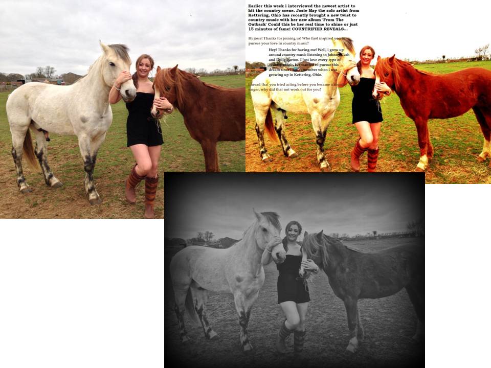
Thursday, 25 April 2013
Editing My Pictures
Problems with my DPS
As i was designing my double page spread i came across some problems. When i had edited my photo that way i wanted it and started writing my interview over the top, i realised that the reader was not going to be able to read the interview as some of the colours were clashing. This meant that i either had to change my writing colours and font, or change my picture. After trying to play around with the colour of my writing and failed i decided to edit my photo in a different way to what i had thought of doing before. Even though this meant steering away from my original idea, i soon realised that it was the best option and the double page spread would look better and more successfull if the interview was clearer.


Tuesday, 23 April 2013
My Genre For My Music Magazine
http://www.youtube.com/watch?v=tDo9_PDFMrY
This Youtube clip is from Taylor Swift's song 'Our Song' and is the genre i am going to focus on to make my music magazine.
This Youtube clip is from Taylor Swift's song 'Our Song' and is the genre i am going to focus on to make my music magazine.

Thursday, 11 April 2013
Semiotics and Representation
Semiotics is a study of signs and how we read them. Every aspect of representaion has some significance, it is a sign. The Signified is a mental concept, the actual thing itself (before the signifier). The Signifier is the verbal manifestation and the sequence of letters or sounds (the written realisation). The combination of the signifier and signified = A Sign.
In photography and art, signs are generally ionic. This means that they look like the thing they represent and are therefore more universally understood. Each element has significance and needs to be identified.

Rhianna is wearing white here and in front of a white background which can show purity and innocence. However this is contradicted by her having her middle finger up and positioned in/on her mouth which can be seen as seductive. Her hair covering half her face can also connate that she is hiding half of her personality from the audience like there is a different side to her.
In photography and art, signs are generally ionic. This means that they look like the thing they represent and are therefore more universally understood. Each element has significance and needs to be identified.
Rhianna is wearing white here and in front of a white background which can show purity and innocence. However this is contradicted by her having her middle finger up and positioned in/on her mouth which can be seen as seductive. Her hair covering half her face can also connate that she is hiding half of her personality from the audience like there is a different side to her.
Pitching My Music Magazine
Name - 'Countrified'
Slogan- (Undesided)
Function Of Magazine- To inform readers of country music and articles related to country singers. Promote music to newly interested audiences.
Type Of Audiences- People who like country music and like to read about the artists and new songs.
Format and Formula- Simple, Country style colours (green, orange, yellow), Earthy Style with a consistent style so audiences recognise my brand.
50% New Country Music
20% Advertisments (Including country CD's etc)
10% Interviews With Artists
10% Fashion
10% News (Artists)
Similar to- 'Country Times' 'Country Music' 'Oklahoma' 'Billboard'
My double page spread will be an interview of a newly introduced Country singer.
Publisher and Demographic Case Study
Kerrang
The world's biggest selling weekly rock magazine. It is published by the Bauer consumer media who own 238 magazines including FHM, Closer, Heat, Grazia and many more. Kerrang appeals to a specific niche audience and identifies its audience as individuals that are independent of thought and musically experienced who are defined by attitude, passion and loyalty.
Readers are 60% males and 40% females generally in the C or D demographic traditionally in the lower middle class or working class. Most readers are of white British ethnicity and 16-24 year's old.
Kerrang have adopted a strategy called synergy to attract greater readership. As Bauer own Kerrang Radio and Kerrang Tv they are able to use those channels to promote their magazine. This is an example of cross media ownership and means that Kerrang can systematically promote their products in several broadcast mediums. As bauer also own other popular magazines they can advertise subscriptions for Kerrang in the hopes of maximising sales and attracting readers.
One survey showed that 83% of readers of Kerrang bought an album as a direct result of an article in their magazine.
Effect On Front Cover Design
A Folk and country music magazine will have a more rural front cover. The publisher will use natural and environmental colour scheme with bold, simple and plain fonts. There will not be anything that would be frowned upon or seen as 'fake' as it is a hearty, homely style.

Dance music is more modern and minimal with simple colour schemes like black, white, brown and blue. The fonts are bold and glamours appealing to modern society.

Indie music can be seen as slightly rough and ready in its approach. There is a DIY ethos where it looks amateurish but in a stylish way where the fonts may be a bit disorganised but look good. The band will be dressed in everyday clothes and most probably look like their audience.

Soul would be likely to go for a classic look with glossy images and timeless fonts with a well groomed artist. It may seem more classy and sophisticated.

Dance music is more modern and minimal with simple colour schemes like black, white, brown and blue. The fonts are bold and glamours appealing to modern society.
Indie music can be seen as slightly rough and ready in its approach. There is a DIY ethos where it looks amateurish but in a stylish way where the fonts may be a bit disorganised but look good. The band will be dressed in everyday clothes and most probably look like their audience.
Soul would be likely to go for a classic look with glossy images and timeless fonts with a well groomed artist. It may seem more classy and sophisticated.
Comparing music magazines
Q magazine
The founders of Q magazine are Mark Ellen and David Hepworth,
Bauer Media Group produce it and it was first published in October 1986 at this
time it was originally called Cue to imply a musical reference ‘ready to play’
but got mistaken as a snooker magazine. In 2006 Q published a reader survey
called ‘100 greatest songs ever’ which was won by Oasis. In late 2008 Q adapted its image, by using a smaller amount of text to create
an increased focus on subjects other than music. This led to criticism from
much of the Q readership, but is
yet to be seen if this change in attitude would affect sales.
The magazine has
a widespread review section, with new releases in music, reissues, music gatherings,
film and live concert reviews, as well as radio and television reviews.
It uses a system of star-ratings from one to five stars. It also accumulates a
list of around eight albums, which it classes as ‘the best new releases of the
last three months’
The majority of
the readers are in the ABC1 area rather than C2DE and it is much more popular
in the age range of 15-34 rather than 35+ and over 2 times more men read it
than women. The issue with this information is we do not know whether the high
popularity within the ABC1 comes from each one or maybe is just from C1 and
with the age it could mainly be 15 year olds or maybe scattered all around that
big age range. The typical reader is
slightly higher up in social class but probably fairly young as it’s not as
popular in 35+ which would imply the audience is mainly teenagers and young
adults.
The house style
of this magazine is fairly consistent throughout for example the heading/title
is the same in every magazine, maybe some slight adaptions made but it is
unnoticeable and the background sticks to quite a pale colour such as white or
grey for most of the issues with a few exceptions being made for certain
artists to fit their genre or the main topic of the issue. The colour and font
of the sell lines and tag lines stick to reds, blacks and whites of quite a
bold font but once again they sometimes change to fit the artist or new
background etc.
Q represents women as sexual items and in some they look
quite animalistic which implies they are dominated and sexualised. Whereas the
men are shown to be quite fierce or dominant even by not showing any particular
facial expression because their face takes up most of the cover but with the
women their bodies are on display or at least shown slightly in the image. This
would mean that for the audience the female audience admire and aspire for the
women in the magazines but have a desire for the men. Whereas the male audience
would have a sexual desire for the women and aspire/respect the men.

Top of the Pops
Top Of The Pops magazine is a monthly publication published by BBC magazines. It features chart information, star gossip, fashion and beauty advice, quizzes, song lyrics and posters. It is a supplementary magazine for the TV show Top Of The Pops until it was cancelled in 2006, however the publication is still in publication.
The magazine was launched in 1995 and is famous for giving The Spice Girls their nicknames. Alongside a revamp of the tv show, it was originally marketed as the missing link between Smash Hits and NME. But its format was gradually changed with less music content and a demographic shift to young girls. It has has several editors over the years including Peter Lorraine, but its current editor is Peter Hart.
The magazine is aimed at 11-14 year old girls Most readers are in the ABC1 category, however their are a small range of young females in C2DE. Most of the readers are probably BC1/C2. The housestyle of the magazine consists of bright colours like pink, yellow and white which connote happiness and purity. This creates a positive atmosphere for the reader and makes in very feminine. The conventions of a Pop magazine are followed extremely well in this magazine including posters of young, inspiring celebrities and 'gossip' from their lives.


Ideology
Ideology- A system of ideas and ideals formed, espeshially one which forms the basis of economic or political theory and policy.
Meme- An idea that spreads from person to person with in a culture.
Tropes- Memes eventually become tropes. A common or overused theme or device become conventions or cliches.
As music has evolved it has split in to different sub genres which have evolved in to certain tropes. When a band first comes together they may experiment with particular looks and sounds to see which best suits them.
Pop vs. Rock- Pop music began to get more heavier during the sixties. However their was still a big divide between simple, inoffensive pop and rebelious rock and roll. This divide still exists now between more commercial mainstream genres and more 'hardcore' styles.
Every genre will have evolved its own tropes over the years which invlove lyrical themes, style of dress and intruments used.
Differences between Rock and Pop-
Pop itself is considered as a softer version of rock and roll as it was derived from rock and roll in the year 1950. However, pop music is a genre that seeks to reach out to a larger audience where as rock music identifies itself as a sub-culture or an ideology that does not reach out to the masses. Pop music is normally performed solo, unlike rock which is usually identified in a band structure. Rock artists also like to perform more live gigs as they like to be motivated by the crowd and their supporters.
Pop music is known to be more about love and heartbreak where as rock is more about the 'sex, drugs and rock 'n' roll'.


At the beginning of The Beatles they would have been seen as a pop band. However when the drug years came some say they became rock spilling over into psychedelic.
Meme- An idea that spreads from person to person with in a culture.
Tropes- Memes eventually become tropes. A common or overused theme or device become conventions or cliches.
As music has evolved it has split in to different sub genres which have evolved in to certain tropes. When a band first comes together they may experiment with particular looks and sounds to see which best suits them.
Pop vs. Rock- Pop music began to get more heavier during the sixties. However their was still a big divide between simple, inoffensive pop and rebelious rock and roll. This divide still exists now between more commercial mainstream genres and more 'hardcore' styles.
Every genre will have evolved its own tropes over the years which invlove lyrical themes, style of dress and intruments used.
Differences between Rock and Pop-
Pop itself is considered as a softer version of rock and roll as it was derived from rock and roll in the year 1950. However, pop music is a genre that seeks to reach out to a larger audience where as rock music identifies itself as a sub-culture or an ideology that does not reach out to the masses. Pop music is normally performed solo, unlike rock which is usually identified in a band structure. Rock artists also like to perform more live gigs as they like to be motivated by the crowd and their supporters.
Pop music is known to be more about love and heartbreak where as rock is more about the 'sex, drugs and rock 'n' roll'.

At the beginning of The Beatles they would have been seen as a pop band. However when the drug years came some say they became rock spilling over into psychedelic.
Subscribe to:
Comments (Atom)